Add a Progress Bar and Segment Markers to Your Video in Premiere Pro
Onscreen navigations can help your viewers. But will it hurt your viewership?
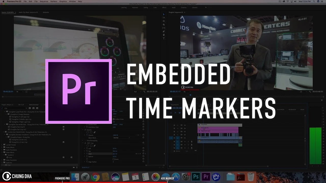
Viewer attention is a big challenge for video creators. Especially when viewers are searching for specific information. One way to help your viewers is adding a burn-in progress bar and segment markers in your videos. These onscreen navigation cues tell viewers how much time is remaining in a video and where they can find specific content. In this tutorial, featuring a video by Chung Dha, you will learn how to create progress bars and segment markers in Premiere Pro. The question is: do you really want to use them in your videos?
What are "Embedded Time Markers"?
The word "embedded" might lead you to think this tutorial is about embedding metadata in your video. Or you might think it's about adding Premiere Pro's chapter markers. Neither of these are correct.
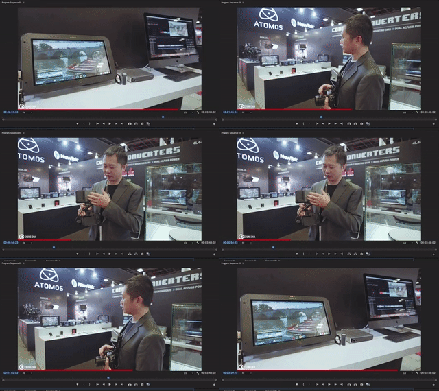
This tutorial is really about the trend of adding progress bars in videos to show viewers how much they've watched and how much time is remaining. Chung takes it a step further by adding text segment markers above the progress bar. See below.
Via Chung Dha
The markers tell viewers where relevant information is located in video. Burn-in progress bars and segment markers can increase the chances of viewers watching or clicking to a specific point in the video.
Create a Progress Bar
- Create a Color Matte by clicking the New Item button in the bottom of the Project panel. Red works well for a progress bar, but you can match the color to your brand as well. Make sure the Color Matte matches your Sequence Settings.
- Drag the Color Matte to the track above your clips. Extend the Color Matte so it covers the entire edit from beginning to end.
- Apply a Crop effect to the Color Matte. Reduce the Top crop so Color Matte is only visible on the bottom of the frame. The exact width of the progress bar is up to you.
- With the playhead at the start of your edit, click the animation stopwatch for the Right crop in the Effect Controls panel to create a keyframe. Change the Right crop amount to 100%. (The progress bar will disappear because it's 100% cropped.) Go to the very end of your edit and set the Right crop to 0%. This will automatically create a second keyframe. The progress bar should be visible and extend to the end
- Scrub your edit to make sure the progress bar plays all the way through your edit.
PRO TIP: Make sure the aspect ratio of your video matches the aspect ratio of your player i.e. YouTube, Instagram, etc. Otherwise there will be a disparity between your progress bar and the player's playhead.
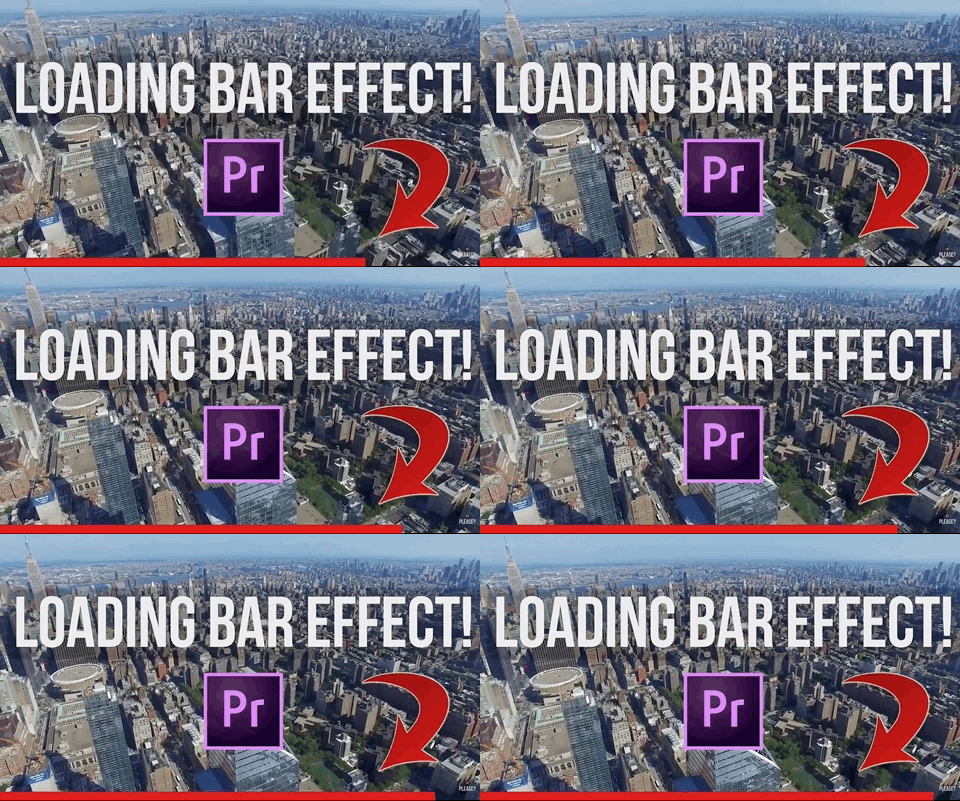
YouTuber Pompsie refers to the same trend as a "Loading Bar Effect". You can watch his tutprial below.
Create Time Markers
- Go to the point in your edit where you want to add a segment marker.
- With the Pen tool, click anywhere in the Program to create a Title. Notice a graphic clip appears in a new track in the Timeline. Chung uses the "|" character to point to the exact time in the progress bar.
- Edit the style of your title in the Essential Graphics panel. You can access the Essential Graphics panel in default Graphics workspace or Window > Essential Graphics.
- Extand the duration of the graphic clip in the Timeline so that it covers the entire duration of your edit.
Bropinion
The philosophy behind progress bars and segment markers is viewers are more likely to continue watching a video if they can see how long it is or how long it will take to get to something relevant. Additionally, the progress bar is a motion graphic which could interest viewers just by being there.
On the other hand, progress bars and segment markers could turn off viewers from watching if they see the video is too long or it doesn't have the information they're looking for. Video creators might get more retention by concealing that information. Of course, we all want to be transparent, right? Don't be clickbait.
What do you think? Do progress bars or segment markers help or hurt viewership? Would you use them in your videos?
Chung Dha
Chung is a photographer and videographer from Rotterdam. He has an enormous library of free Premiere Pro tutorials and presets. Support Chung by donating any amount to his PayPal. Subscribe to his YouTube channel and follow him on social media. For questions, join his Facebook group.


