VideoRevealed: Adobe User Interface Clues!
The Adobe engineers work hard to make as much of the Adobe experience as "discoverable" as possible. By creating user interface standards, Adobe makes it easier for users to make there way around an application even with minimal experience. They also break out of that mold when they need something new for a specific job. This tutorial will take you on a tour of some of the most import Adobe user interface components. —VideoRevealed
Premiere Pro is full of hidden features, and some of them harder to find than others. As Colin Smith of VideoRevealed says at 0:18, the Adobe Premiere Pro engineers try to make all the features in the application as "discoverable" as possible. You can imagine this is quite a challenge! That's why Colin created this tutorial to help us understand some of the key UI characteristics in the Adobe applications - Premiere Pro primarily.
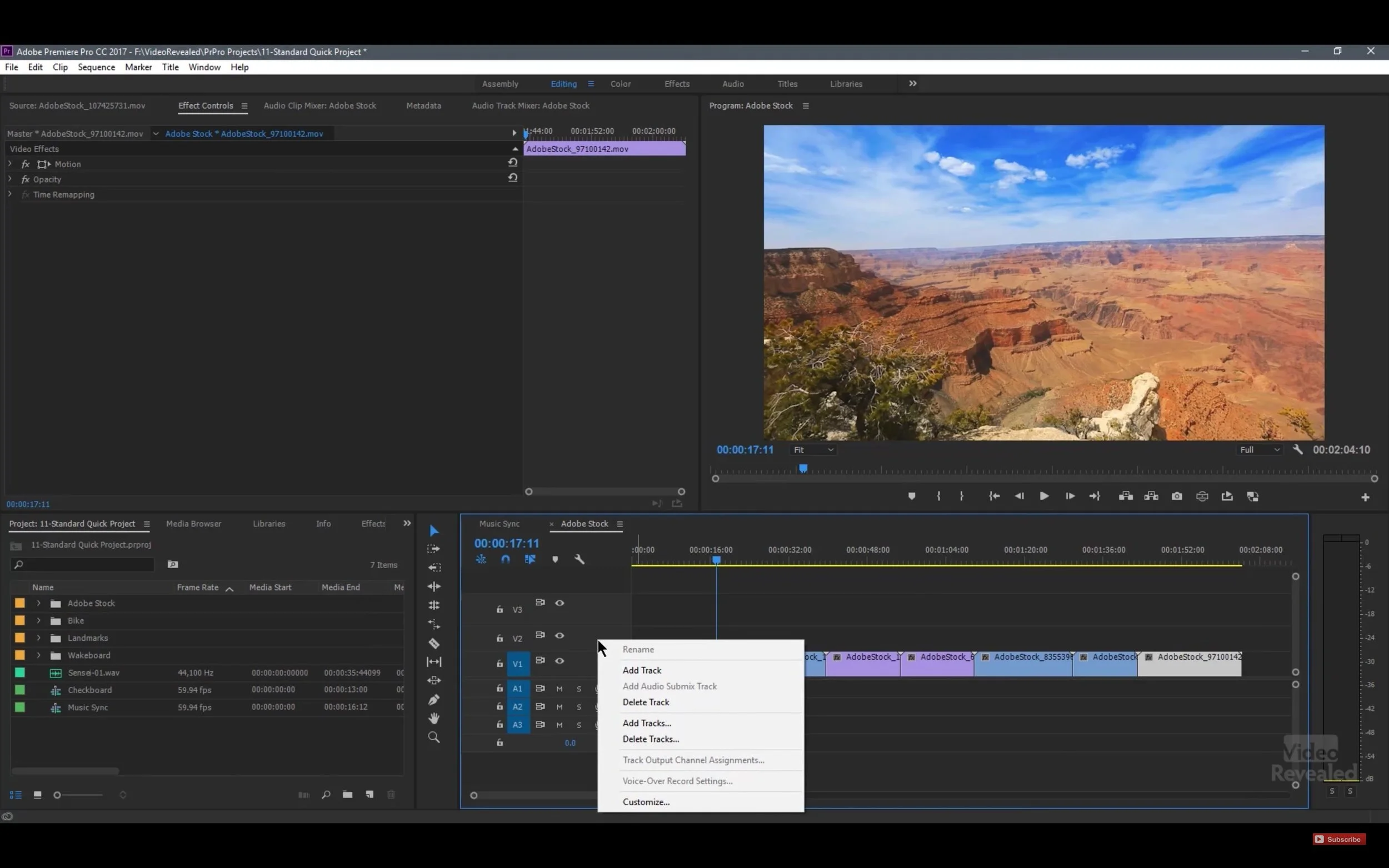
The first interface clue at 1:09 is simple: right-click on everything! Right-clicking reveals contextual menus, meaning the menus are different depending on the context or where you're clicking. Watch what happens at when Colin starts right-clicking inside Premiere Pro.
Right-click in Premiere Pro to reveal contextual menus.
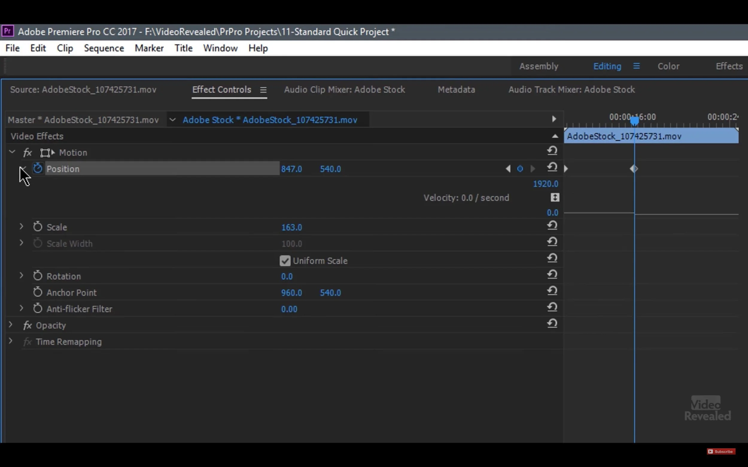
Next is disclosure triangles. Clicking disclosure triangles twirls down many important features in Premiere Pro. For example, at 2:14 Colin shows how to access the Velocity Graph in the Effects Controls panel by clicking the disclosure triangles next to the Motion settings that have keyframes.
Click the disclosure triangles in the Effect Controls panel to reveal the Velocity Graph.
Thirdly, those three horizontal lines on the right side of every panel name in Premiere Pro are fly-out menus, commonly called "hamburger menus". And clicking on them reveals a lot of useful panel-specific preferences. For example, this is where you can find the docking options for each panel. Starting at 3:29 Colin shows what some of the hamburger menus look like in Premiere Pro.
Clicking "hamburger menus" in Premiere Pro reveals panel-specific preferences.
Let's throw a wrench in here. Literally. Clicking the wrench icons in Premiere Pro reveals a ton of settings for the panels that have them, like the Program, Source and Timeline panels. Watch as Colin clicks the wrench icon in Premiere Pro at 5:31.
Clicking the wrench icons in Premiere Pro opens different settings for the panels that have them.
Colin goes on for another 7 minutes, highlighting even more helpful Adobe UI tips. Some of these include Sync settings, finding panels, creating new items, and on and on. Well worth watching to the end!


